Rory Sutherland claims recoloring the London tube map could ease crowding
Advertising executive Rory Sutherland argues map colors steer riders, and says perception fixes could work cheaply.
 Nudge Podcast · #63: Rory Sutherland | Why counter-intuitive thinking wins
Rory Sutherland, vice chairman of Ogilvy UK, was arguing that transit bosses spend too much on steel and signals and too little on human perception when he offered a mischievous fix for London.
Too much money, he argues, goes to engineering projects with easily measured results, like a new set of track switches, while psychological fixes are dismissed because their benefits are harder to count. Then he pointed to the familiar map of the Underground.
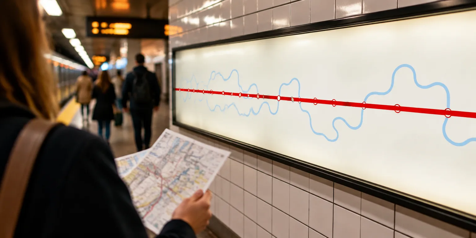
His line was blunt: “I could improve the tube overnight by making the Victoria line red and the Central line duck egg blue.”
Sutherland argues riders pick routes by how the map looks. As Sutherland puts it, “far too many people use the Central line” because it is red and runs “in a straight line from left to right.” By contrast, he says, “far too few people use the Victoria line” because it is “blue not very visible and wiggly.”
In Sutherland’s argument, passengers read straight and bright as fast and simple, and wiggly and dim as slow and complicated. The fix, in his telling, is not to lay new track but to change maps, signs, and arrival displays to work with how riders see. Solving the problem psychologically, he argues, may deliver more passenger comfort and more trips “at a tiny minuscule fraction of the cost of an engineering solution to the same problem.”
He contrasts transport with television. Engineers who design televisions, he notes, build around the eye, which perceives only the relative strength of red, green, and blue. There is no yellow pixel, he notes, “because yellow and equal amounts of red and green are indistinguishable to the human brain.” Televisions, he argues, are designed around human perception, but transport networks are not, and they should be.
Questions people ask
Why would color and shape change which train I take?
Bright, high-contrast colors grab attention first, and straight lines look shorter and simpler than winding ones. Riders scanning a complex map often use those visual shortcuts instead of comparing actual travel times. That is why a red, straight line can feel faster even when another route is equally quick.
How can a TV show yellow if it only makes red, green, and blue?
A screen mixes tiny red, green, and blue lights at different intensities, and your eye blends them. When red and green lights fire together at similar strength, the brain perceives yellow. The same mixing creates the rest of the colors you see.
What makes a psychological fix so much cheaper than an engineering fix?
Changing a map, repainting lines, or updating arrival information is mostly design and software work. Building track, buying trains, or moving stations requires construction, land, and years of disruption. If perception is guiding behavior, the design change can capture much of the benefit for very little money.